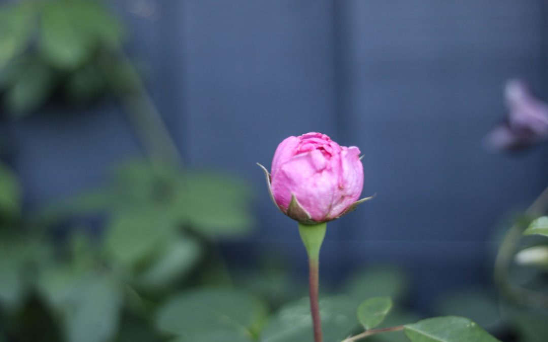
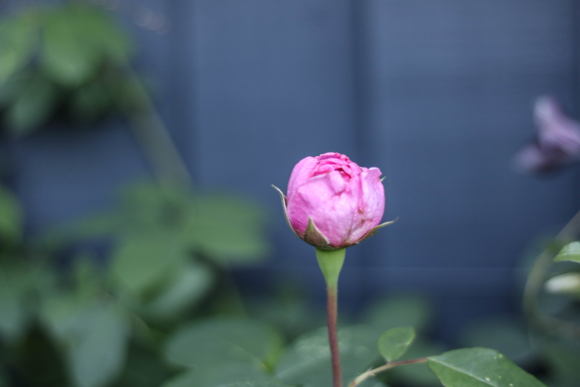
This time last year, I had just returned from a family Christmas in South Africa. I had wandered round vineyards, explored botanical gardens and generally lounged outside and in the pool. It was a truly magical time.
Although I always shed a tear or two at the end of big holidays (I know, I don’t think I ever really grew up), I’m so lucky to come back to a home I love. Last year however, my garden was a very different story. After a holiday of bright sunlight and colour, the return to my grey, dead garden made me feel sad.
Now, I know gardens don’t look their best during the Winter. But I’m not just talking about a garden out-of-bloom and bedded down for the season. I’m ashamed to say it, but it verged on actual neglect.
I’m a designer. I also like a challenge; to give things a go. But with a crazy busy start to the year, and not a green finger or toe on my body, the garden was a step too far. That’s when I got garden designer Melissa Morton on-board, and boy am I glad I did!
Not only was this the start of Project Garden Revamp, but the start of a discussion about design both inside and out, and how to ensure consistency between the two. It was also the start of our #colourconversation (a series of collaborative blog posts on colour).
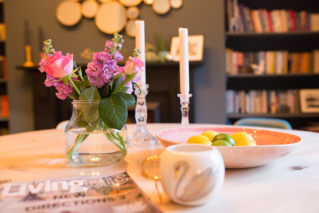
I have a large sash window in my dining room which looks out over the garden. I confess, I had been known to leave the roman blind down so that visitors couldn’t see drab space (and decaying plants) outside. It’s amazing how the external space can impact on your enjoyment (or not) of your interior space.
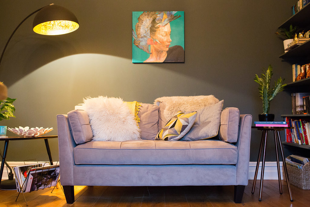
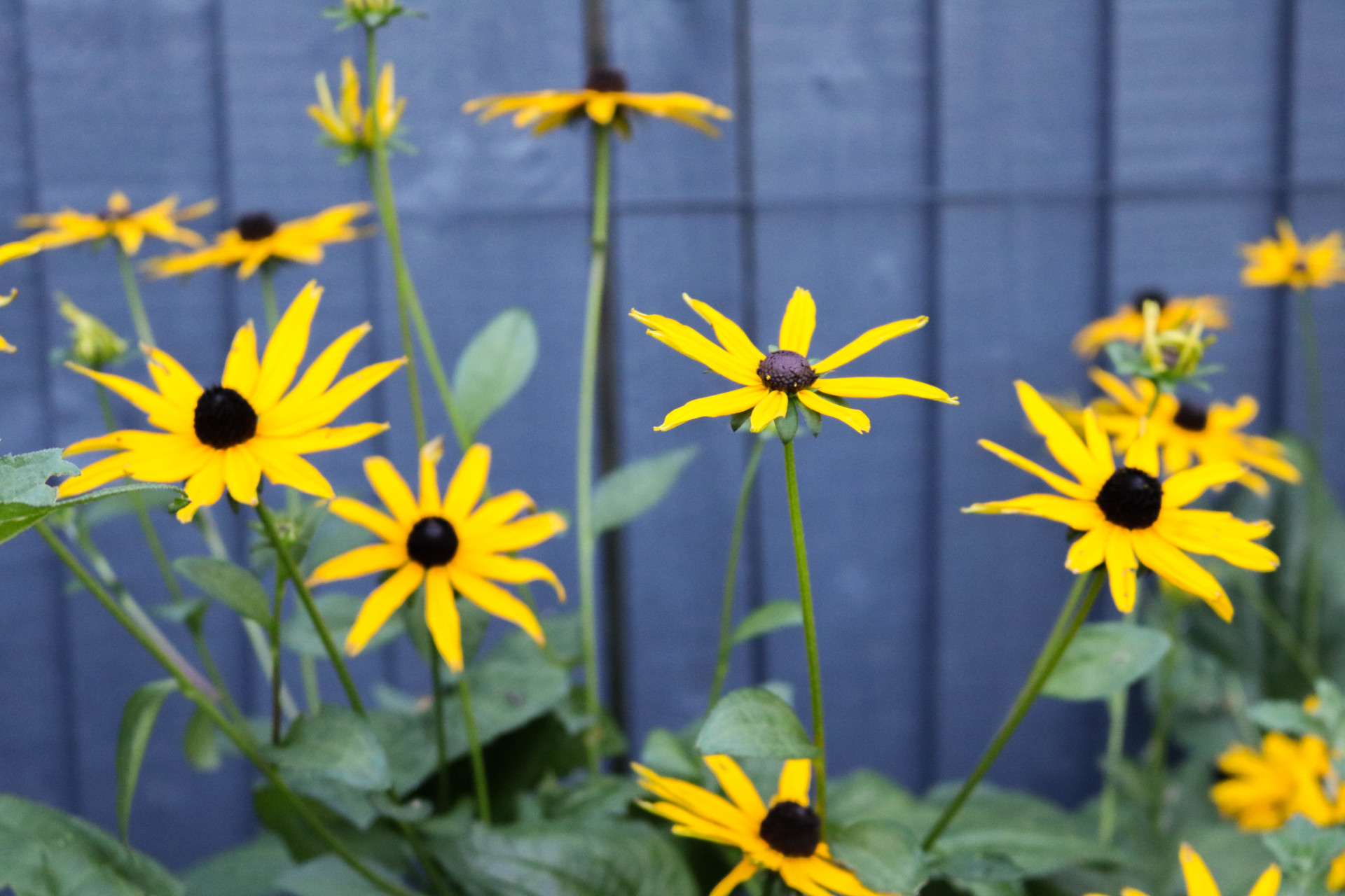
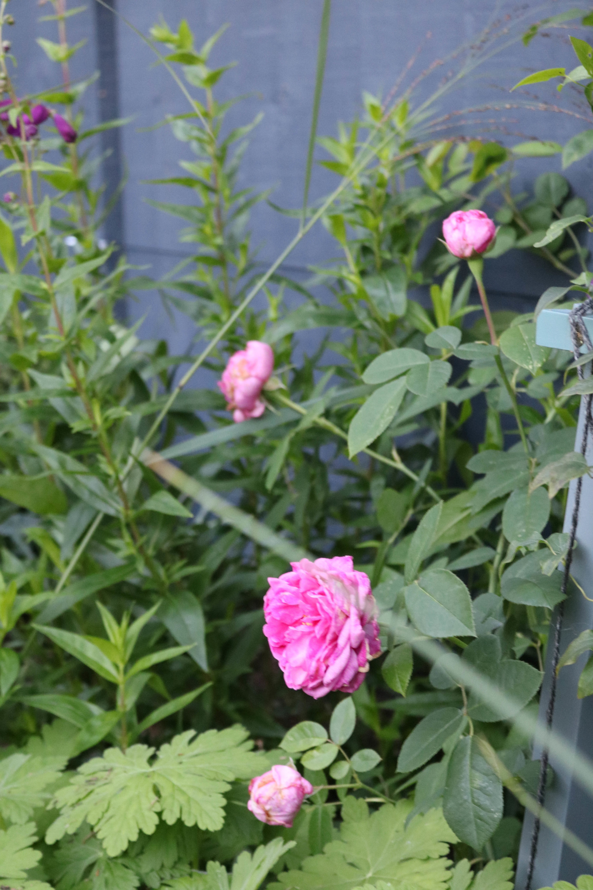
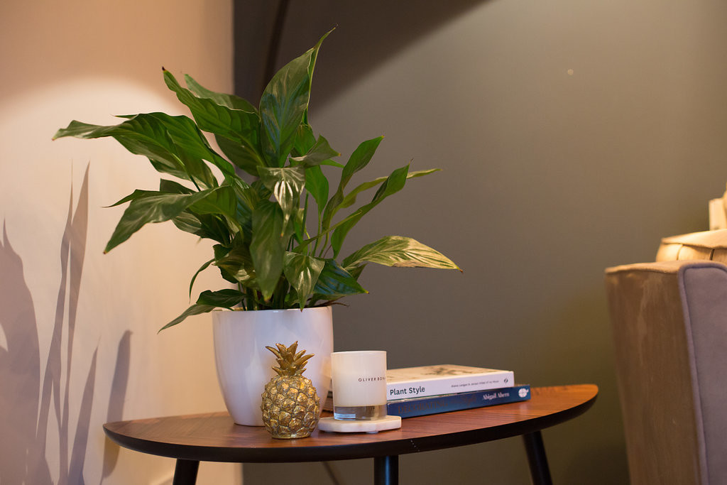
One thing I love doing in rooms, is using a dark background against which I contrast more vibrant colour. My dining room is painted with Farrow & Ball Down Pipe and I play with a palette of more vibrant yellows and pinks against this. During our consultation, the first thing Melissa suggested doing was to paint the fence a dark grey to match the dining room walls. A simple idea but one which had never crossed my mind (even though I’ll happily paint any wall inside dark). Yet the result is transformative. It gives the whole space a more contemporary feel and provides a fabulous background against which the greens come alive, and other colours have a real vibrancy.
In order to develop this consistency we chose a colour palette for the planting which echoed my dining room scheme. A spectrum of pinks, accents of yellows as well as some whites to add balance. Clearly there’s more to garden design than colour choices (just as there’s more to interior design than choosing your wall colours) but even some simple changes and an eye to consistency between inside and out really helps create a more refined scheme.
As an Interior Designer I get to style up my finished rooms straightaway and show you the results. Melissa needs to be more patient (as I am learning to be) for nature to do it’s thing; for plants to flower and mature. With my now green-ish fingers, I’ll be sharing some shots of the colours in my garden as they emerge. And with Spring just around the corner (fingers crossed!) hopefully that won’t be too long now.
Keep an eye out and do join our #colourconversation. We’d love to hear how you enjoy incorporating colour in your homes and gardens.
I’ve started a Colour Conversation blog series with Melissa Morton Garden Design. With a background in colour science, Melissa knows her stuff about the theory of colour. She’s written a couple of posts about Hue and Saturation and Value which set out the fundamentals. This post sits alongside those and follows on from my previous piece which looked at the basics of colour psychology.
In the context of Interiors, I’m looking at how colour makes us feel, and am starting with a look at background colour. By this I mean the base or surrounding colour for my design; the walls, the floor and the ceiling (and it’s important not to forget the ceiling; it shouldn’t just get a coat of white paint at the end!).
Put more technically it’s the colour that surrounds the objects of interest. These background, or surround colours are important because they determine how other colours appear. When Melissa talks about background colour in gardens, she’s looking at the background colour to the foliage, flowers and garden furniture. For gardens, the background colours are the masses of trees, woody structure, the sky, grasses and other surfaces as well as fences and walls.
I just feel fortunate that in interiors most of my background colours stay pretty much the same (give or take the odd change in lighting). Melissa’s background colours are forever changing with the seasons!
What should your background be?
So how do you decide whether to go dark or keep it light? Should you add bold colour to the walls and what about pattern?!! Pinterest and Instagram don’t necessarily help either; there are so many beautiful images that it can be difficult to know what style suits you and your home.
Back to basics: You
When I’m designing a room, I go right back to basics. This isn’t about finding a Pinterest image and copying that style. It’s about finding out what a client wants a space to FEEL like. Do they want it to feel warm, soft and cocoon like, or do they want something more invigorating and energising? More vibrant colours lend themselves to the latter, whereas more subtle tones work for the former.
I also want to know what colours and tones a client is instantly drawn to. It may be “on-trend” to paint your walls dark, and whilst it can be cocooning for some, it can be energy sapping for others. This can make for quite a depressing living room experience, regardless of how Instagramable it may look! Whereas if you respond to a floaty, delicate environment, then you’re going to feel far more at home with softer tones.
It’s the advice of Mad About The House Kate Watson-Smyth, but I agree whole-heartedly. Open your wardrobe and take a look at the colours you wear. They are likely to be the tones and combinations you respond well to. It’s often a good starting point.
Back to basics: The Space
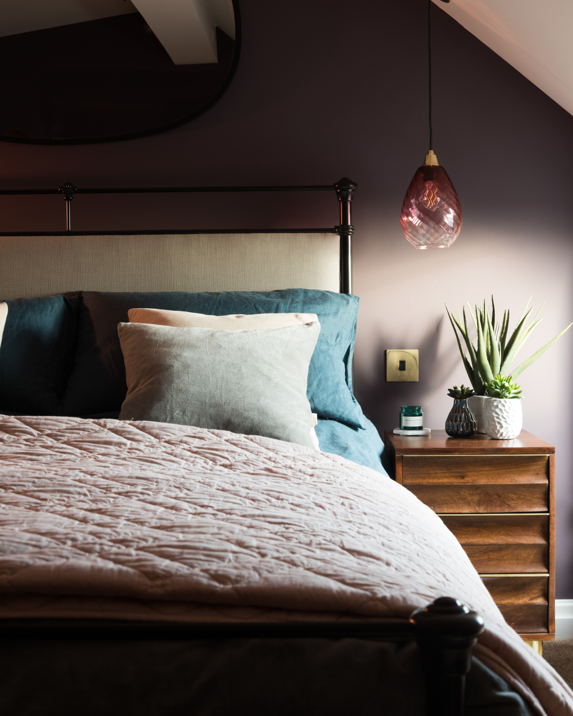
It may sound obvious but check out the light in your space. It will determine how colour is perceived. Don’t paint a tiny room dark? I disagree; in a small room there is less light. Paint it white and it’ll look dingy; a kind of white-pants-that-have-turned-grey-in-the-wash look. It’s not a great! Paint it in a navy blue and you have instant depth that can be enhanced and illuminated with clever lighting as required. Far more chic!
And look outside. If you have foliage by the window, or trees in view what’s the impact on light? If it casts a green glow, or just blocks natural light in summer, then keep that in mind. Also think about the strength of the light source outside. If it’s South facing and the light is bright then the colour intensity is weakened.
So do you go Dark or Light? Or somewhere in between?
DARK
Here we’re talking about shades, low value colours. This is where black pigment is added to a colour (the hue) to make it darker.
So when I’m talking about dark backgrounds think deep greys and midnight blues. Moody and cocooning, they form a fabulous backdrop against which you can layer your design. The key is recognising the almost absence of colour in your background. It’s bold but it works because it allows other colours to pop against it. Other brights, pale pastels or whites; they all work by creating contrast. Or you can layer dark on dark if you want a really dramatic look. It’s a great background for botanical styling.
LIGHT
In colour science terms, a light colour is a high value colour. Often referred to as a tint, which comes from the process of lightening paints by adding white pigment.
It is often be seen as the safe option; a light, neutral backdrop, but it certainly doesn’t have to be boring (and can actually be quite tricky to find the right shade of white or grey!). A neutral base can create an elegant, calming tone. Layered with texture, neutral backgrounds can provide a super sophisticated look. Or you can use it as a base to offset pattern or more vibrant colours, letting colours shine where they may have got lost against a darker backdrop. The key is determining whether you want a warm or cool tone. Get that right and then you have a fabulously light backdrop upon which you can build your design.
Of course, you don’t have to go to one extreme or the other. There’s a whole spectrum in-between. Which is why colour is so much fun to play with. Ultimately, it’s all about personal preference and recognising how you respond to certain colours.