Spaces that tell your story

Designing homes to enhance, enchant and delight the lives of those who live there.
Home is a feeling; a place for love and laughter. The backdrop for emotional connection, the place where memories are made.
Our approach reaches beyond aesthetics, designing authentic spaces to be loved and lived in, for years to come. We believe in thoughtful design to enrich your everyday; creating homes that are familiar, welcoming and beautiful. At the heart of every design is our client’s story.
Whether we’re working on a farmhouse country cottage, a period townhouse or a villa in South Africa, we ensure that our work is sympathetic to the existing architecture whilst creating a space which is reinvigorated and suited to the needs of modern life.
All homes have a story to tell, and we love embracing the beautiful imperfections of period homes. We’re committed to creating timeless designs, moving beyond trends to combine old and new in a way that respects both the past and the future. As a studio, we are working hard to ensure a more sustainable approach to design.
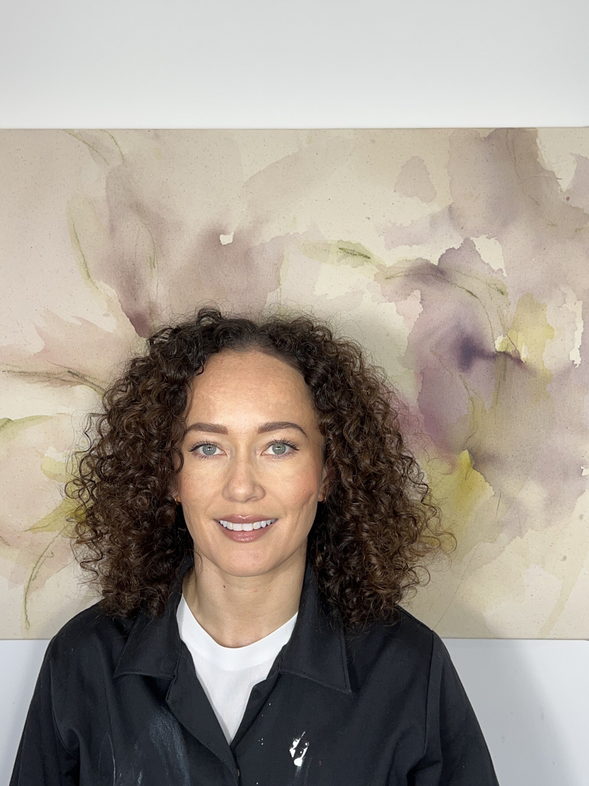
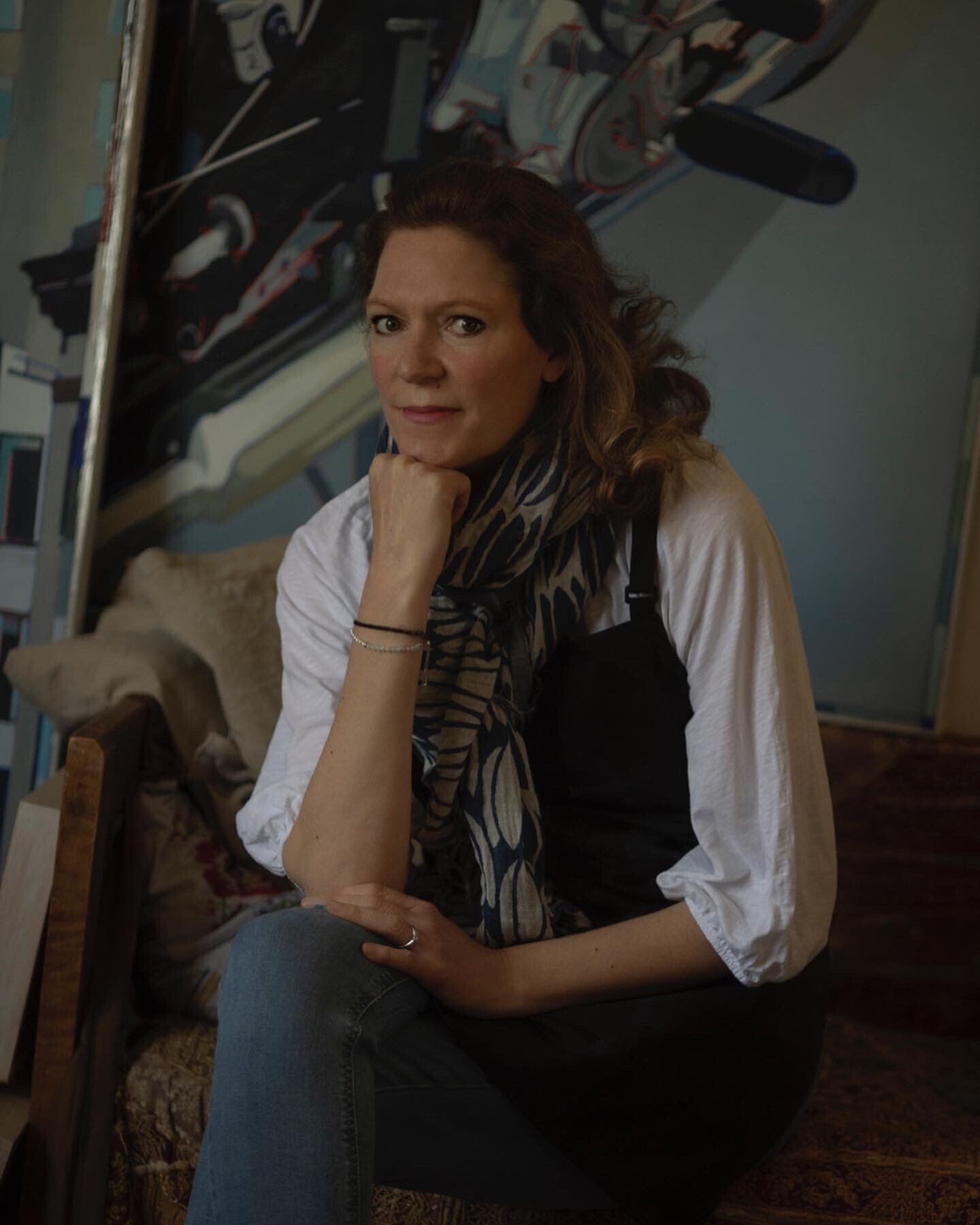
About Caroline
Passionate about creating homes to enjoy.
Caroline’s approach steers away from fashions or trends, focusing instead on the personality and lifestyle of every individual to create authentic and timeless design throughout the home.
With an empathetic and friendly manner, Caroline carefully listens and understands her clients’ needs, with the firm belief that the design process, as well as the end result, is there to be thoroughly enjoyed.


Recent Projects


“I get a thrill every time I open the front door. It really does look (and feel and smell) wonderful.”
“You have the elusive blend of creative talent with technical knowledge”.
How We Work
Storylines offers a comprehensive Interior Design service, working with clients from concept to completion and adopting a collaborative approach to create a home you love.
We work with a limited number of clients at any one time, with a focus on whole house and multiple room refurbishments. This allows us to really get to know our clients, creating spaces that flow, connect and tell their stories. Be assured that very element of your design is creatively and carefully considered, taking you seamlessly from brief to implementation.
We offer a Design Consultation service for smaller projects or specific design queries. The studio can, depending on capacity, take on single-room designs and design-only clients so please get in touch to discuss your project.

An Interior Designer’s