What’s your favourite colour?  Interiors: How colour makes you feel. 

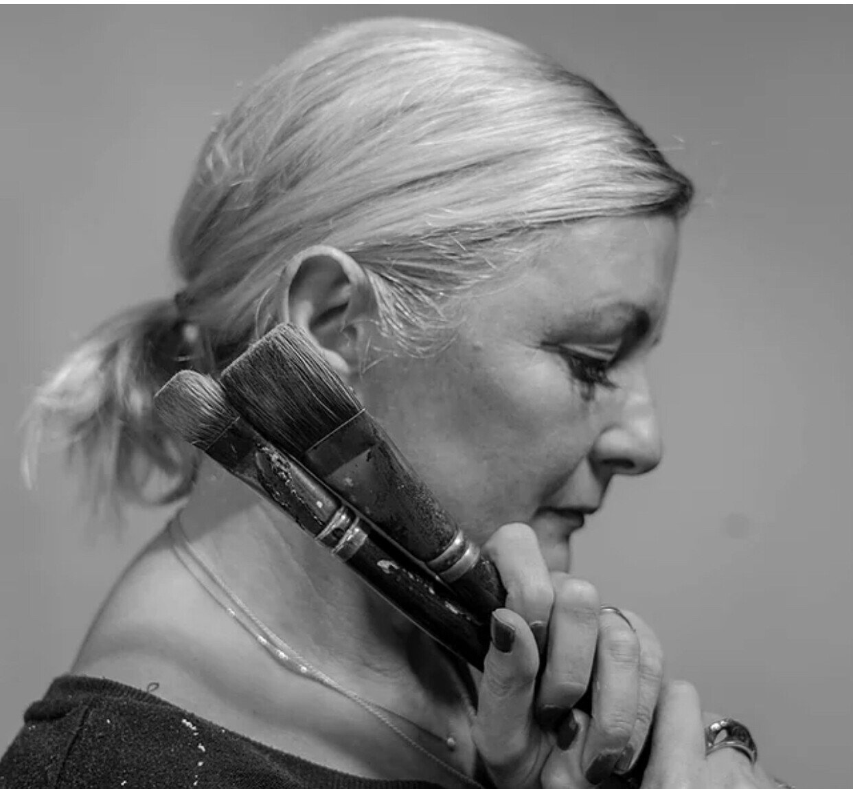
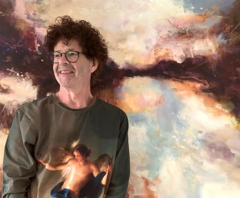
I’ve been working with the very talented Garden Designer, Melissa Morton recently. Back in the summer she did some work on my garden for me and I helped her out with some interior design. A neat little skills swap! Working with another designer as a client was really interesting and it has been fascinating to discuss our respective design processes. And, not only does Melissa have super green fingers and an eye for detail, she also has a background in colour science, which means we’ve had some really interesting conversations over the past few months. 

These discussions were the starting point for this collaborative series of blog posts which explore concepts of colour and design in both the home and garden. Melissa has started the series with an analysis of colour theory. Her first post “How Hue Can Influence Mood” can be read here. Her next post will explore Saturation and Value.

In this post, I explore how colour influences mood in Interiors; the basics of Colour Psychology. 

What’s your favourite colour?

It’s a question asked to, and by, many a small child. From such an early age we are beginning to identify that everyone has an emotional response to colour. And that everyone’s response is different.

When I start working with a client, one of my first questions is how they want the space to FEEL. Obviously we work through the practicalities of what the space needs to do, discuss style inspiration and budget, but fundamentally, I need to understand what they want the room to feel like. Without that the design can tick all the other boxes, but it just won’t feel quite right. 

Colour is powerful. It evokes feelings subconsciously. Yet there isn’t a one-size-fits-all approach to colour. I love midnight blue. It feels calming and reflective and has a real energy to it. But I know clients for whom the same colour is drab, draining almost. It’s very personal. So, whilst I’m about to give a run down of how colours are more generally perceived, it’s intended as a way of making you think about how you respond to colour. If you find yellow leaves you feeling anxious, then painting a room yellow is not going to be the uplifting, self-confident experience I suggest it could be!


Purple

Dark purple shades are dramatic, powerful and sophisticated. Historically the colour of royalty, it can evoke feelings of strength, quality and luxury. In softer tones, purple often suggest a calmness and serenity. To some, a mystical quality. Thoughtful, provocative and creative. 

Ultra Violet was Pantone’s color of the year for 2018. And a recent love for all things velvet has paved the way for a luscious combination of colour and texture. Yet, purple initiates somewhat of a Marmite response in people. It seems, you either Love or Hate it in interiors. Used in bolder shades, it’s definitely a statement colour. This doesn’t mean you have to use it sparingly but you need to know the effect it’ll have. And if you just want to dip your toe in the purple water, then just use it as an accent (perhaps a footstool, a cushion or within some wall art).

Blue

Blues can make us feel productive, intelligent, calm and serene. Deep blues can work to give a feeling of sophistication whereas bright blues can provide a sense of clarity and vibrancy. As for lighter tones, they are often described as making a space feel calm, soothing and serene. 

Personally, I love surrounding myself with rich midnight, navy and cobalt blues. I find them warming, enriching and energising. As for light blues, I find them too cool to have in my home. Yet I’ve done schemes using soft blues which my clients find soothing and calming and they love them. It’s all about personal perception and association. 

Yellow 

The sunshine colour. The colour of primroses and spring. But does it make you feel confident, happy and extrovert or does it leave you feeling anxious and self-conscious? 

Bright yellows create bold, confident accents. One of my favourite combinations is to use it with a bold blue or strong teal. Softer lemon colours can create a feeling of spring time, of optimism and lightness. This is where colour association really strikes a chord for me though. As a child, I remember having a bedroom painted in lemony yellow. For some reason, I disliked it and now an abundance of soft yellow in a room leaves me feeling uneasy. There’s no logic to it; it’s simply my response to living with softer tones of that colour. On the other hand, vibrant tones leave me feeling energised and creative.


Green

Melissa has written about green in her latest blog post. The colour of nature, of abundance, of growth. One of the reasons I love styling with plants is the freshness and vibrancy of colour. It’s a reminder that our spaces are not static, but living-breathing spaces. It gives a sense of balance and harmony. 

Rich, earthy greens will make you feel very differently from the vibrant, zesty lime greens. And, for some, green is a colour which induces feelings of stagnation. If that’s you, a green living room is probably not the way forward!

Pink

We’ve seen a lot of pink recently, showing that pink is most certainly not just for girls. Blush, nude, millennial, hot, neon. The list goes on but there’s certainly a shade for everyone and every room! Has millennial pink had it’s day? Probably, as does every trend, but pink is certainly an adaptable colour, here to stay.

It’s generally perceived as a warm, reassuringly optimistic colour. Associated with love and happiness and a colour which sits easily in many a colour scheme. Although of course to some it may have associations of childishness, evoking feelings of silliness.

Black 

Technically the absence of light, rather than a colour, black is bold, powerful and glamorous. A show of sophistication and elegance at black tie events but symbolic of mourning at funerals.

For some, the intensity and contrast created by using black in an interior scheme is indulgent and dramatic. For others, the use of black in a scheme is too much. Too heavy, too intense, too draining. How you respond also depends on how it’s used. Layered with other dark colours (charcoals, indulgent earth browns) it can create a moody, dramatic scheme which you may (or may not) love. Used as a contrast colour for other softer or more vibrant colours creates a different feel altogether. 

White 

Clean, simple, pure to some. Clinical and stark to others. A pure, brilliant white is difficult to work with but whites with a hint of colour create a palette of soft whites which work more authentically within a space. How much white you choose to surround yourself with depends on whether white spaces leave you feeling calm and energised. Or just a little cold and empty. 

So there you have it, my very quick run down of colour psychology. I know, orange, brown and red don’t get a mention and I didn’t even touch on grey (that gets a post all of its own). But the discussion of colour psychology is lengthy, and what I wanted to do is start to build on the science of Melissa’s post and show you how colour plays such a big part in what a space feels like. What it really comes down to is how you respond. Your perception. Your association. It’s yet another reminder that you need to decorate and style your home for you; to surround yourself with colours that you love. 

So, what is your favourite colour?